It's a bird! It's a plane! It's Super-Con!
As mentioned on our previous Comic Art Friday, I whiled away last Saturday at Super-Con, a fine and fancy comic book convention held at the Oakland Convention Center. It was a terrific con — much more comfortable and leisurely than the always jam-packed WonderCon, held at San Francisco's Moscone Center in late winter. (In fact, Super-Con takes place in the venue WonderCon outgrew a few years ago.)
The one genuine bummer of the day was the fact that I forgot my camera. Otherwise, I'd have photos to share from the event. Alas, you'll have to make do with my rambling prose. And some comic art, of course, which we'll get to in a few paragraphs.
I arrived at the convention center shortly before the 10 a.m. starting time, early enough to be one of the first 250 attendees. This meant that my first bonus of the day was a limited-edition print by artist Chris Marrinan — a wicked cool black-and-white drawing featuring Wolverine, Batman, Wonder Woman, Spider-Man, and a couple of other superheroes. Alas, even such timely arrival proved insufficient to net me a spot on the sketch list of the enormously popular Adam Hughes, a list that had just closed moments before I reached the line. Adam and his boon companion Allison were, however, both gracious and apologetic. Next time, maybe I'll be luckier.
At WonderCon in February, I commissioned a Ms. Marvel drawing from the amazing artist known as Buzz. A couple of weeks ago, Buzz had advised me that he would deliver the completed art in person at Super-Con. The man held up his end of the bargain in sensational fashion, not only turning out a beautiful piece for me, but even supersizing it from 11" x 14" to 14" x 17" at no extra charge. Is that customer service, or what?

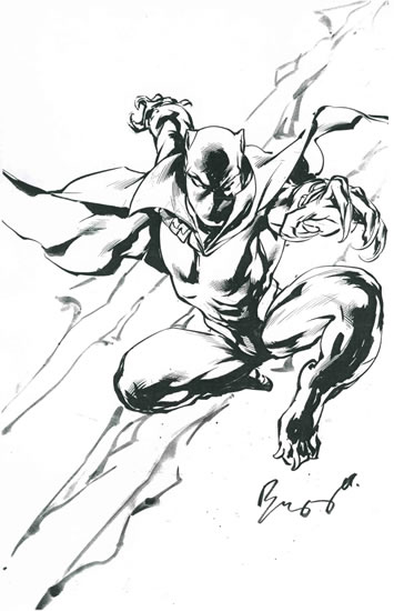
As we were exchanging e-mails about the Ms. Marvel commission, Buzz asked whether he could start another piece for me that he could finish at the con. That inquiry resulted in this dynamic pinup for my Black Panther collection. It was a kick stopping by Buzz's table periodically during the day to watch this drawing take form.

Not many comic artists ink with a brush these days, and Buzz's incredible technique gives his work a stylized, highly distinctive look. These two new pieces nicely complement the Vixen artwork Buzz did for me at WonderCon last year.
While Buzz finished my Panther, I sat in on two excellent panel discussions. Artist Thomas Yeates -- assisted on an impromptu basis by writer-artist Al Gordon -- gave a fascinating presentation called "From Script to Panel." Tom handed out a couple of pages of author Kurt Busiek's script from an issue of Dark Horse Comics' Conan series, on which Yeates had created basic layouts for the series' regular artist, Cary Nord, to finish. Then Tom walked us through the steps, drawing on an easel pad, of his process of translating Busiek's scene descriptions and dialogue into pictures. I learned a ton about sequential storytelling during that hour.
I also attended a panel about comic book cover art, conducted by artists Adam Hughes, Phil Noto, and Dan Brereton. For me, the most interesting facet of this lively discussion was the bit about iconic covers as opposed to what I think of as narrative or storytelling covers -- the kind I grew up on in the '60s and '70s, especially on Marvel Comics books. All three artists opined that their foremost job as cover artists is to make their book stand out from the dozens of choices on the comic shop wall. Their best way to do that is with a strong image, even when that image may not directly and specifically reflect an event that occurs inside the book. (All three, however, noted that their approach is to use that strong image to represent the interior content, but more by capturing the flavor of the story than by literally representing something that happens in it.)
The artists observed that back in the day, most comics were sold in spinner racks, so the reader only saw the cover after he or she had already made the decision -- based on the title -- to pull the book out of the rack. Narrative-focused covers made more sense then, because they were designed to appeal mostly to people who were interested in the book anyway. Today, every cover is usually fully visible on the wall of a comic shop, and more readers are captured by the image on the cover than by the title of the book. As Dan Brereton put it,
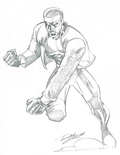
One other artwork found its way into my collection during the day — this pinup of DC Comics' Mr. Terrific, drawn by one of my favorite artists, Ron Lim. Ron was excited to do this piece, because he hadn't drawn Mr. Terrific before. The piece turned out terrific. (Ron made that joke himself. I'm just repeating it.) Ron is a super-nice guy, and I enjoy talking with him almost as much as I enjoy his art. His style is very much a throwback to the classic artists of the '70s and '80s, so I dig what he does. Any opportunity to have Ron draw a new piece for me makes Uncle Swan a most happy fellow.

In between panels and waiting for my art to get finished, I chatted with a few of the artists I'd met before. Ernie Chan had for sale on his table a gorgeous piece that was a takeoff on the Storm/Beta Ray Bill Common Elements commission he did for me -- this one replaced Bill with Thor, and changed the perspective, but I recognized it immediately. I was tempted to buy it as a complement to my piece, but I'd spent enough cash already. I also rummaged through a few comic dealers' bargain bins looking for cheap back issues of Suicide Squad (I'm trying to complete my set of issues on which Geof Isherwood was the penciler) and Black Panther (from the run of issues written by Christopher Priest, and illustrated by the penciler/inker team of Sal Velluto and Bob Almond). Plus, I wandered around enjoying the often bizarre sights that always accompany a con.
Super-Con's the last convention in the Bay Area until WonderCon next March. I'll have ample time to plan my next assault on Artists' Alley, and to save up for it.
Sorry I couldn't take you all with me. But don't you sort of feel like you were there?
The one genuine bummer of the day was the fact that I forgot my camera. Otherwise, I'd have photos to share from the event. Alas, you'll have to make do with my rambling prose. And some comic art, of course, which we'll get to in a few paragraphs.
I arrived at the convention center shortly before the 10 a.m. starting time, early enough to be one of the first 250 attendees. This meant that my first bonus of the day was a limited-edition print by artist Chris Marrinan — a wicked cool black-and-white drawing featuring Wolverine, Batman, Wonder Woman, Spider-Man, and a couple of other superheroes. Alas, even such timely arrival proved insufficient to net me a spot on the sketch list of the enormously popular Adam Hughes, a list that had just closed moments before I reached the line. Adam and his boon companion Allison were, however, both gracious and apologetic. Next time, maybe I'll be luckier.
At WonderCon in February, I commissioned a Ms. Marvel drawing from the amazing artist known as Buzz. A couple of weeks ago, Buzz had advised me that he would deliver the completed art in person at Super-Con. The man held up his end of the bargain in sensational fashion, not only turning out a beautiful piece for me, but even supersizing it from 11" x 14" to 14" x 17" at no extra charge. Is that customer service, or what?

As we were exchanging e-mails about the Ms. Marvel commission, Buzz asked whether he could start another piece for me that he could finish at the con. That inquiry resulted in this dynamic pinup for my Black Panther collection. It was a kick stopping by Buzz's table periodically during the day to watch this drawing take form.

Not many comic artists ink with a brush these days, and Buzz's incredible technique gives his work a stylized, highly distinctive look. These two new pieces nicely complement the Vixen artwork Buzz did for me at WonderCon last year.
While Buzz finished my Panther, I sat in on two excellent panel discussions. Artist Thomas Yeates -- assisted on an impromptu basis by writer-artist Al Gordon -- gave a fascinating presentation called "From Script to Panel." Tom handed out a couple of pages of author Kurt Busiek's script from an issue of Dark Horse Comics' Conan series, on which Yeates had created basic layouts for the series' regular artist, Cary Nord, to finish. Then Tom walked us through the steps, drawing on an easel pad, of his process of translating Busiek's scene descriptions and dialogue into pictures. I learned a ton about sequential storytelling during that hour.
I also attended a panel about comic book cover art, conducted by artists Adam Hughes, Phil Noto, and Dan Brereton. For me, the most interesting facet of this lively discussion was the bit about iconic covers as opposed to what I think of as narrative or storytelling covers -- the kind I grew up on in the '60s and '70s, especially on Marvel Comics books. All three artists opined that their foremost job as cover artists is to make their book stand out from the dozens of choices on the comic shop wall. Their best way to do that is with a strong image, even when that image may not directly and specifically reflect an event that occurs inside the book. (All three, however, noted that their approach is to use that strong image to represent the interior content, but more by capturing the flavor of the story than by literally representing something that happens in it.)
The artists observed that back in the day, most comics were sold in spinner racks, so the reader only saw the cover after he or she had already made the decision -- based on the title -- to pull the book out of the rack. Narrative-focused covers made more sense then, because they were designed to appeal mostly to people who were interested in the book anyway. Today, every cover is usually fully visible on the wall of a comic shop, and more readers are captured by the image on the cover than by the title of the book. As Dan Brereton put it,
"Customers in the comic shop are faced with hundreds of covers, all screaming at them. As a cover artist, your job is to make your cover scream the loudest."I had never really thought of the situation that way. I now better understand the philosophy behind iconic covers -- it's another reflection of how the industry has changed since my comics-reading heyday in the '60s, '70s, and early '80s.
One other artwork found its way into my collection during the day — this pinup of DC Comics' Mr. Terrific, drawn by one of my favorite artists, Ron Lim. Ron was excited to do this piece, because he hadn't drawn Mr. Terrific before. The piece turned out terrific. (Ron made that joke himself. I'm just repeating it.) Ron is a super-nice guy, and I enjoy talking with him almost as much as I enjoy his art. His style is very much a throwback to the classic artists of the '70s and '80s, so I dig what he does. Any opportunity to have Ron draw a new piece for me makes Uncle Swan a most happy fellow.

In between panels and waiting for my art to get finished, I chatted with a few of the artists I'd met before. Ernie Chan had for sale on his table a gorgeous piece that was a takeoff on the Storm/Beta Ray Bill Common Elements commission he did for me -- this one replaced Bill with Thor, and changed the perspective, but I recognized it immediately. I was tempted to buy it as a complement to my piece, but I'd spent enough cash already. I also rummaged through a few comic dealers' bargain bins looking for cheap back issues of Suicide Squad (I'm trying to complete my set of issues on which Geof Isherwood was the penciler) and Black Panther (from the run of issues written by Christopher Priest, and illustrated by the penciler/inker team of Sal Velluto and Bob Almond). Plus, I wandered around enjoying the often bizarre sights that always accompany a con.
Super-Con's the last convention in the Bay Area until WonderCon next March. I'll have ample time to plan my next assault on Artists' Alley, and to save up for it.
Sorry I couldn't take you all with me. But don't you sort of feel like you were there?
Labels: Comic Art Friday


0 insisted on sticking two cents in:
Post a Comment
<< Home